
ascii branding & web design
Branding, web design, SMM, and R&D for an AI coding tool — built around the aesthetic of gothic brutality, technological precision, and nature.



About ascii
→ Request
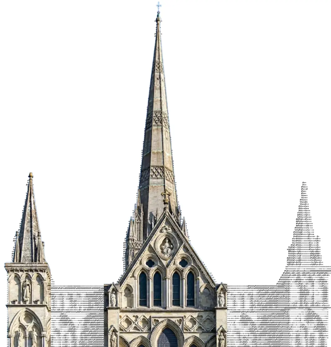
The team built an AI-powered coding tool inspired by gothic architecture, ASCII art, and the pioneers of computing — Turing, Jobs, Dalí, Monet. They needed branding that could hold all of it without falling apart.
We ran a co-creation sprint: mapped the references, extracted the essence, and assembled a visual system from opposing forces — cold precision and organic form.
The brief was unlike anything standard. ascii brought a collection of inspirations: gothic cathedrals, ASCII-rendered nature, the aesthetics of early computing, and portraits of thinkers who changed their field. Our job was to distill that into a coherent identity.
We started with a naming workshop, moved into moodboarding, and refined the concept through direct collaboration with the founders — three rounds, two pivots, one clear direction.
«We came with our vibes, Curves turned them into the unique and ambitious mix of gothic brutality, technological precision, and soft touch of nature and humanity»
→ Co-creation
We designed the co-creation process as a visual journey: ascii art → naming → inspiration board → branding → product. Each stage built on the last.
Design case study
→ Logo
The logomark — a sharp four-pointed star with a square cutout — references both the asterisk character and the precision of machine output. The wordmark in grotesque keeps it grounded and readable at any scale.
We tested the logo in dark and light contexts, across digital and physical surfaces, and fine-tuned spacing until it felt inevitable.
→ Our Concept
The visual concept fuses three forces: gothic architectural weight, the clinical precision of ASCII rendering, and the organic textures of natural form — a leaf, a cathedral spire, a human face.
We built a mood system that lets the brand shift between cold and warm, digital and physical, without losing coherence.
→ Web-design
We designed the ascii product landing from scratch: architecture, copy structure, visual hierarchy. The page had to explain a technical product to a developer audience without dumbing it down.
→ SMM media
We built a content system for LinkedIn — templates, voice, visual rhythm. Posts that feel native to the platform while staying unmistakably ascii.
Your Pocket CTO — AI-powered coding assistant that thinks like a senior engineer. Built for developers who ship fast.
Control all your agents in ascii. One interface, full visibility, no context-switching.
The intersection of art and engineering. ascii brings both together in one seamless flow.
«The people who are crazy enough to think they can change the world are the ones who do.»
→ Assets
Brand assets — icons, patterns, textures, type specimens — packaged for the ascii team to use across all touchpoints without design intervention.
R&D
Let's take a look at our concepts and the concepts of the R&D boards — four directions explored before we converged on the final system.
Before finalising the visual language, we built four parallel concept boards — each exploring a different axis of the brand. Zoom in to inspect the details.
Review
We came with our vibes, Curves turned them into the unique and ambitious mix of gothic brutality, technological precision, and soft touch of nature and humanity. The team understood what we were going for before we could fully articulate it ourselves.
Team
Management
Liza Bychkova
Design
Liza Bychkova
R&D
Curves R&D Team