
ascii branding & web design
We built a brand and digital presence for an early-stage startup from the visual identity to web-design — and keep evolving it through iterations.


About ascii
→ Request
Identity that could hold both the soul of the product and the personalities of the co-founders, so the brand felt as human as it was futuristic and courageous.
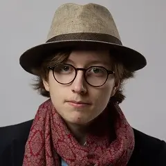
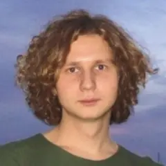
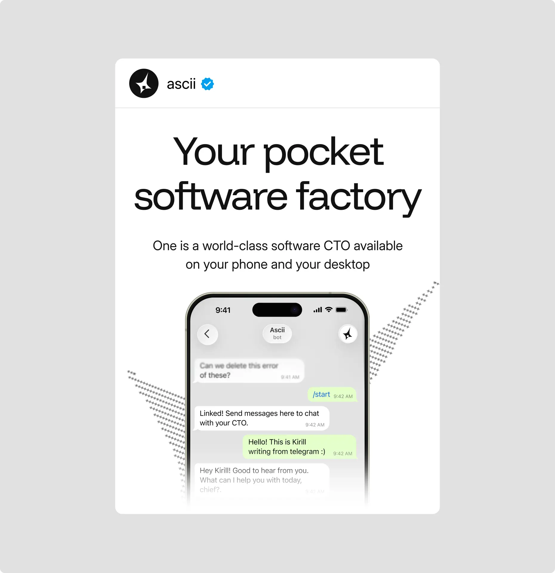
Born from Ariana, an open-source foundation built by Anicet and Kirill, ascii evolved into an AI-powered pocket CTO — a platform managing cloud coding agents. The market agreed: 6x ARR growth and a $500K pre-seed, just weeks after launch.
To match that ambition, the identity was built on tension — gothic geometry meeting ascii texture, organic brushing against the algorithmic. A visual world as rigorous as the product it represents.
«We came with our vibes, Curves turned them into the unique and ambitious mix of gothic brutality, technological precision, and soft touch of nature and humanity»
Co-founder
→ Co-creation
Working in a fast-moving AI context, we explored multiple concepts to find the right balance between technology, creativity, and the founders’ own vision. The final identity grew from this exploration, combining the strongest elements from different directions into one cohesive system.
More than a visual layer, the branding became part of how ascii defined itself.
Design case study
→ Logo
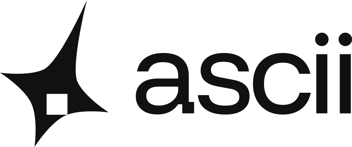
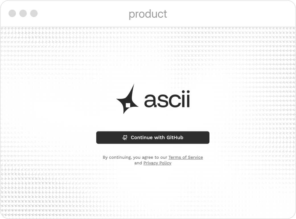
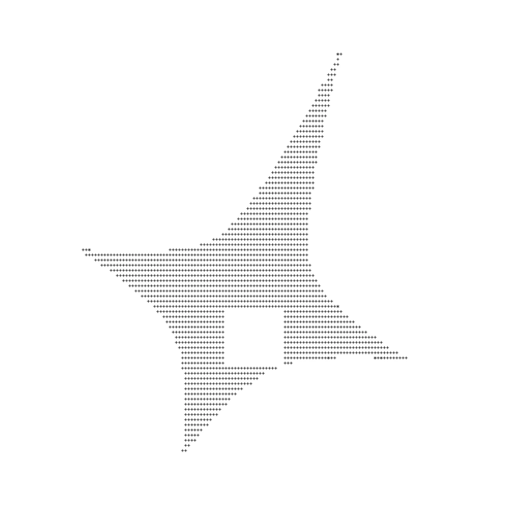
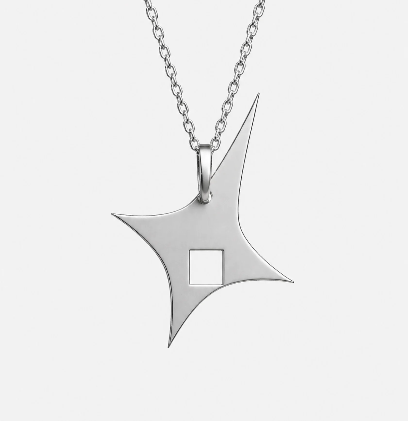
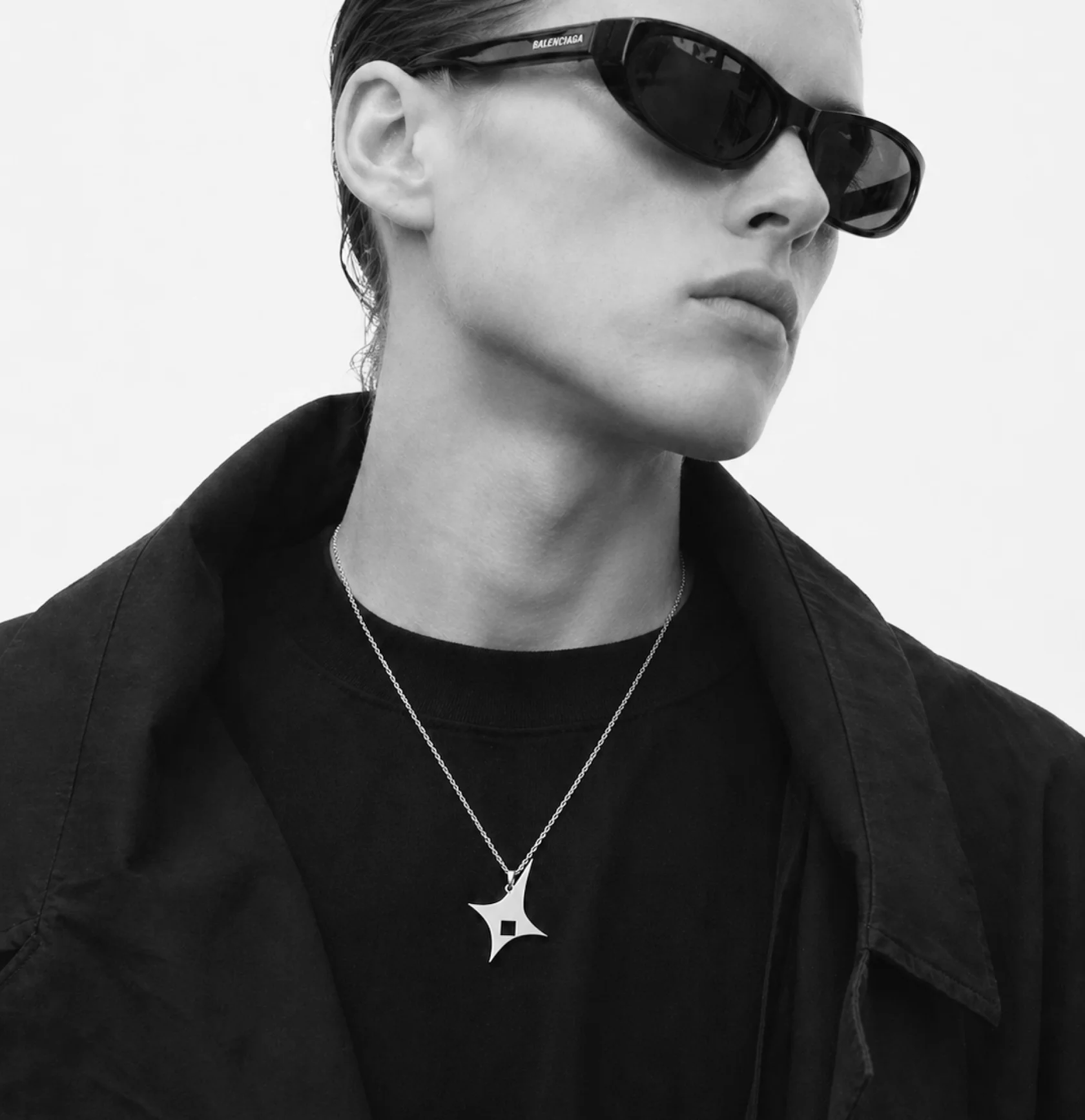
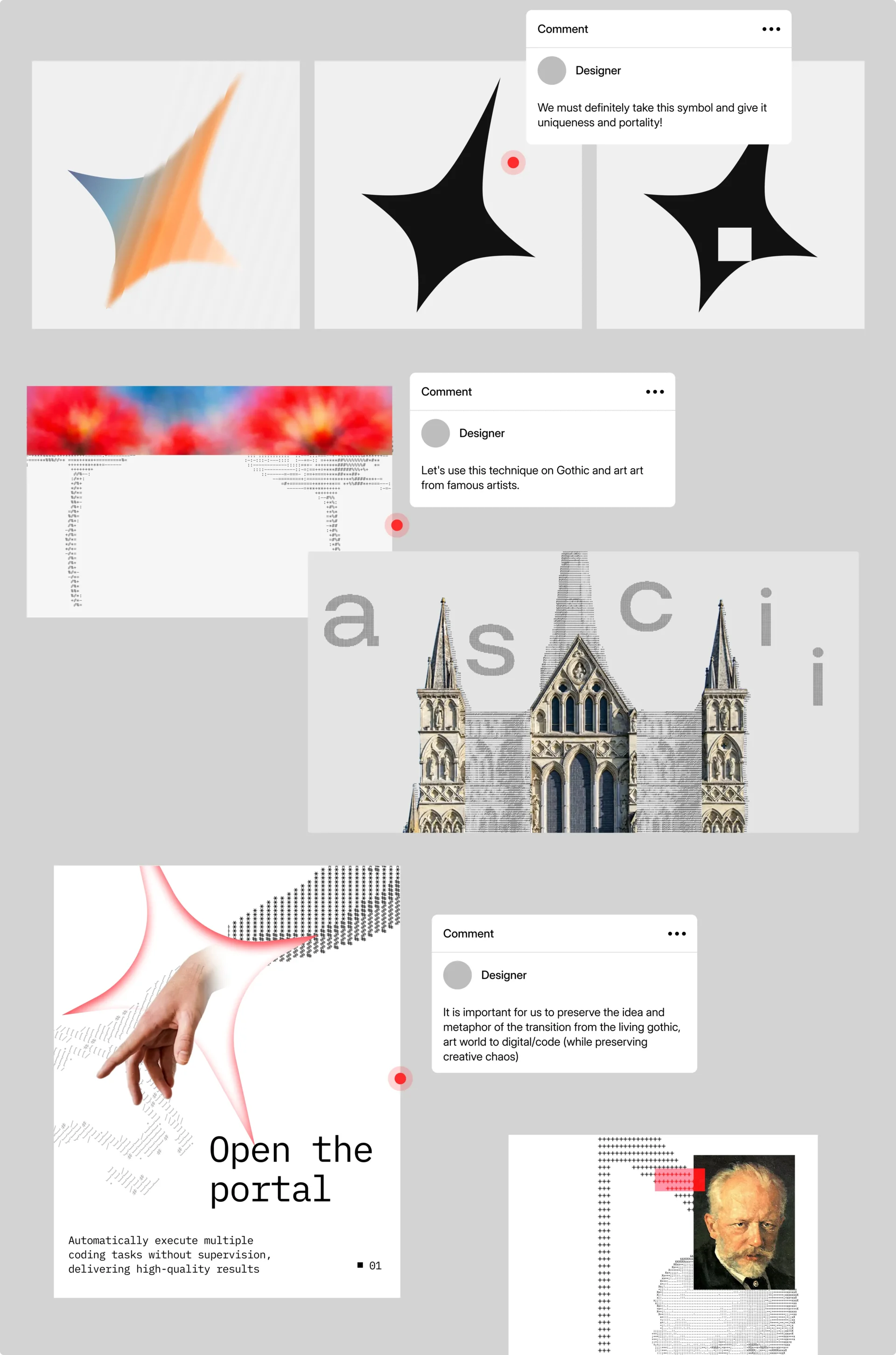
We took as a basis the unique shape of the star, which conveys an atmosphere of mystery, and the branded square neckline as an open portal to enter the new digital world for users.


→ Our Concept
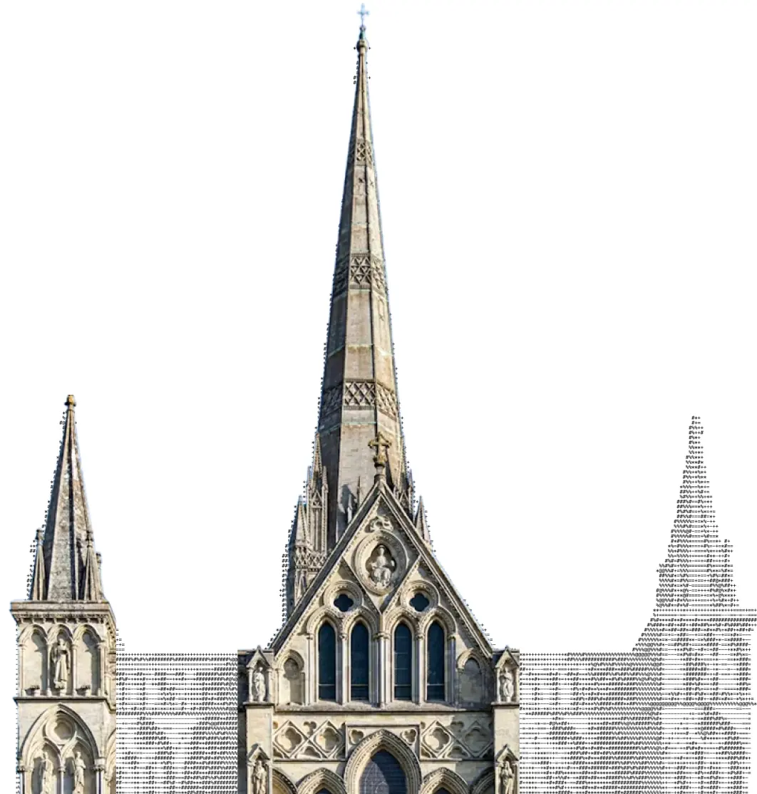
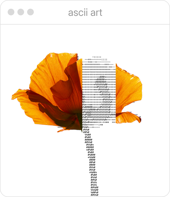
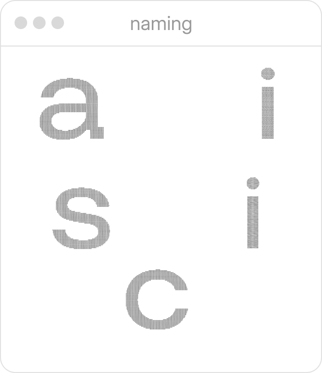
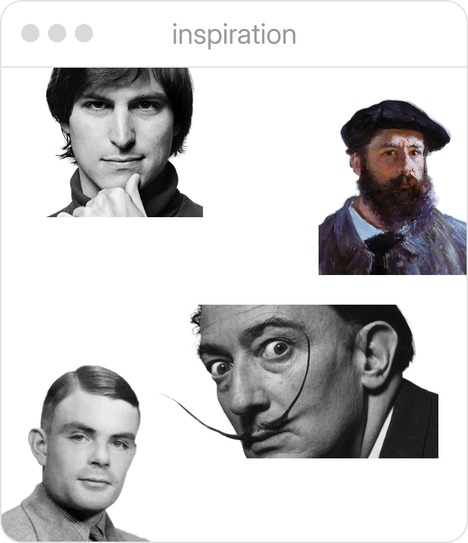
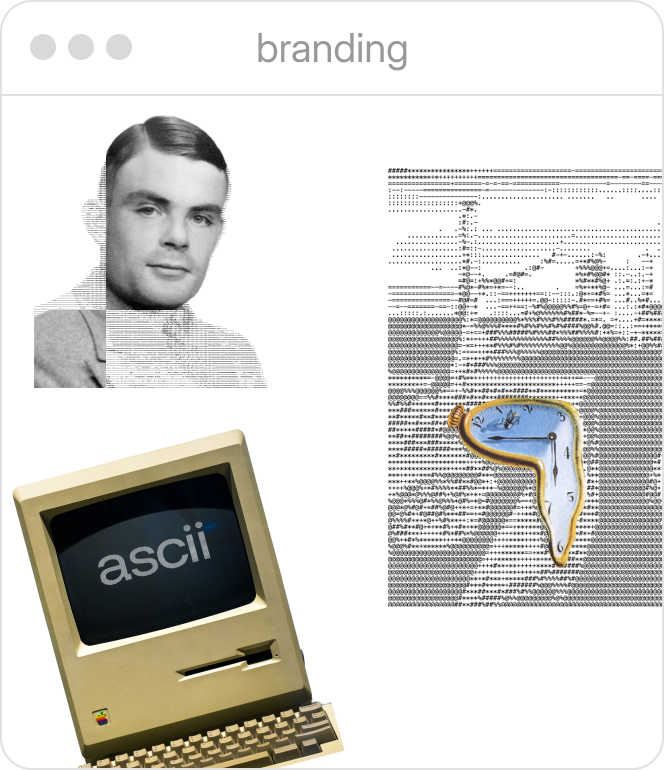
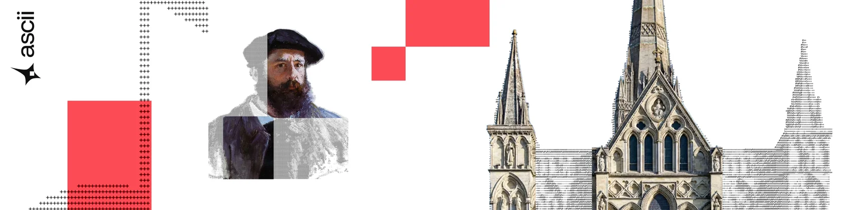
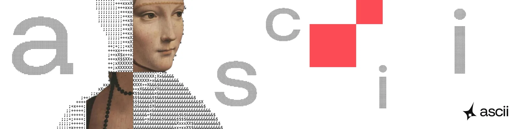
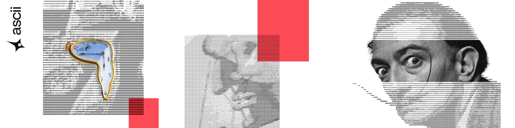
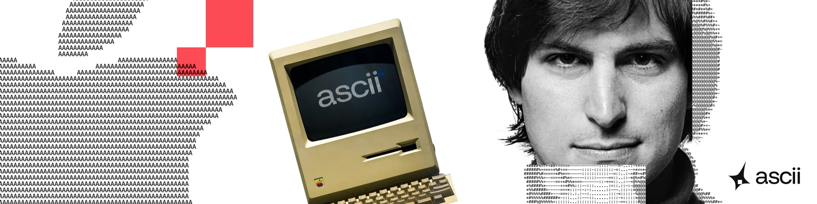
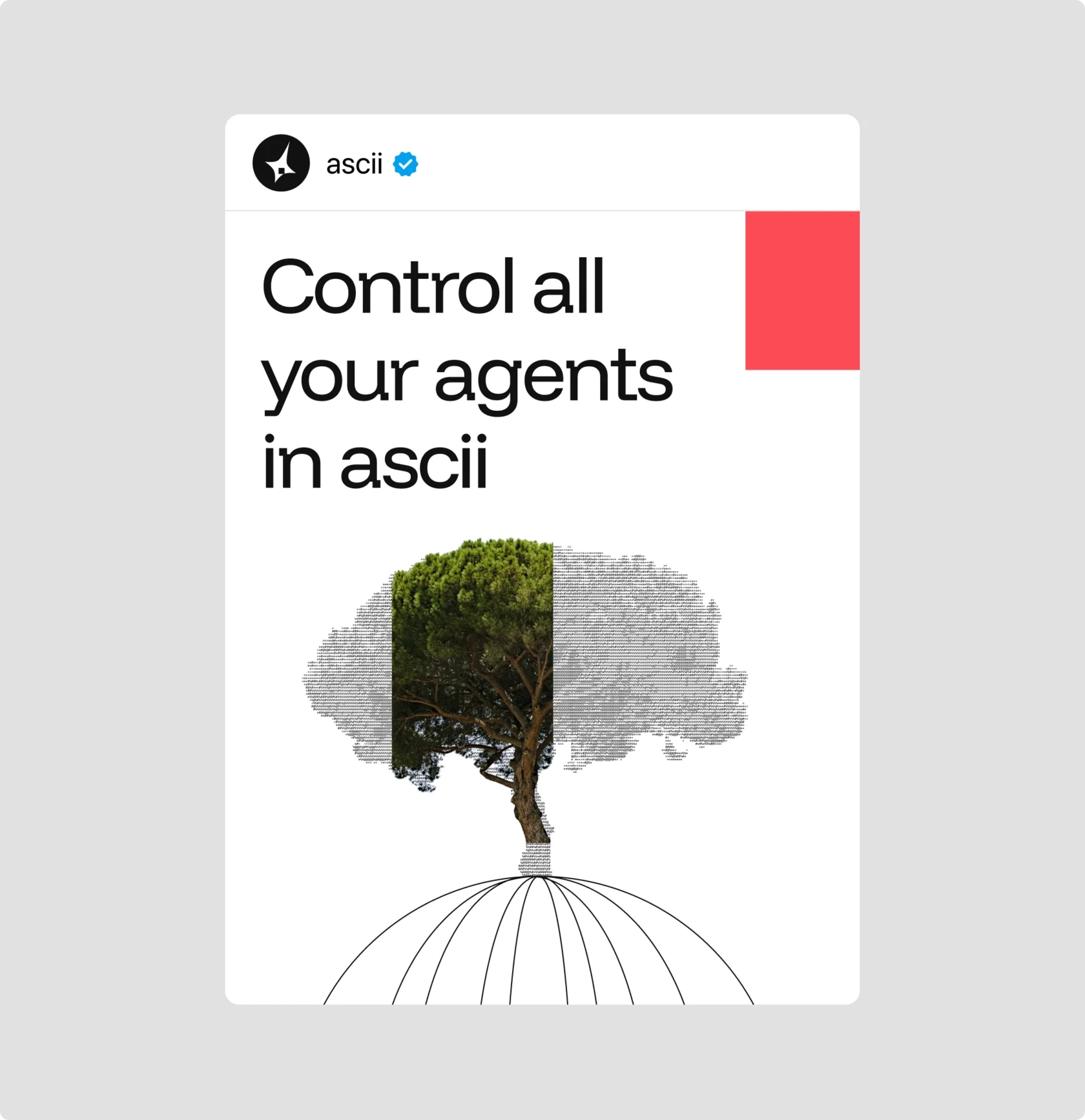
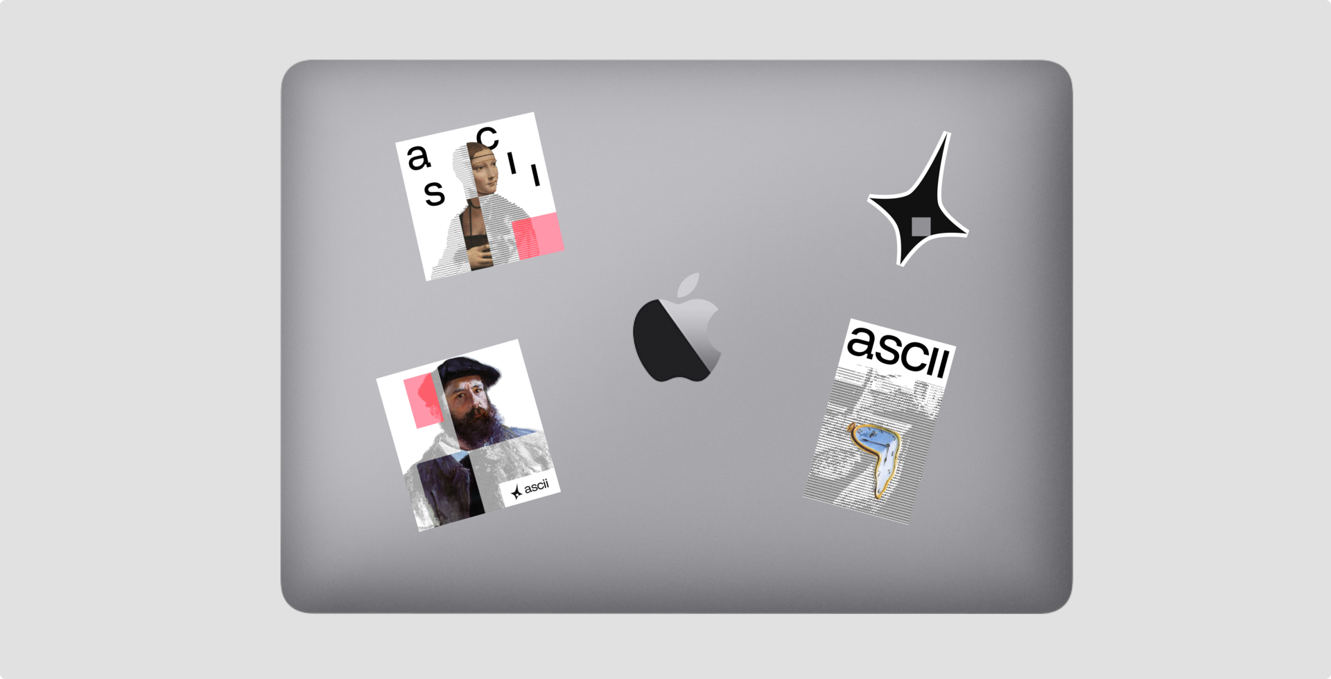
Three worlds collide in a single experience — timeless drama of Gothic architecture, raw humanity of inspiring figures, and the cold precision of ASCII art — all funnelled through our portal where beauty becomes code.
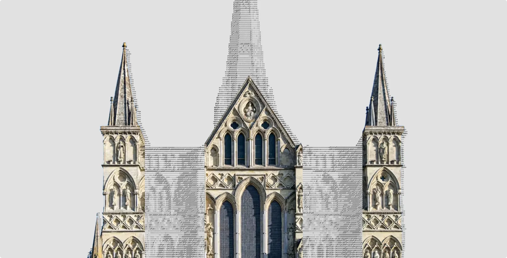
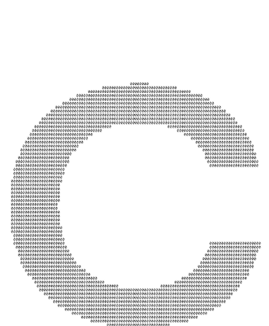
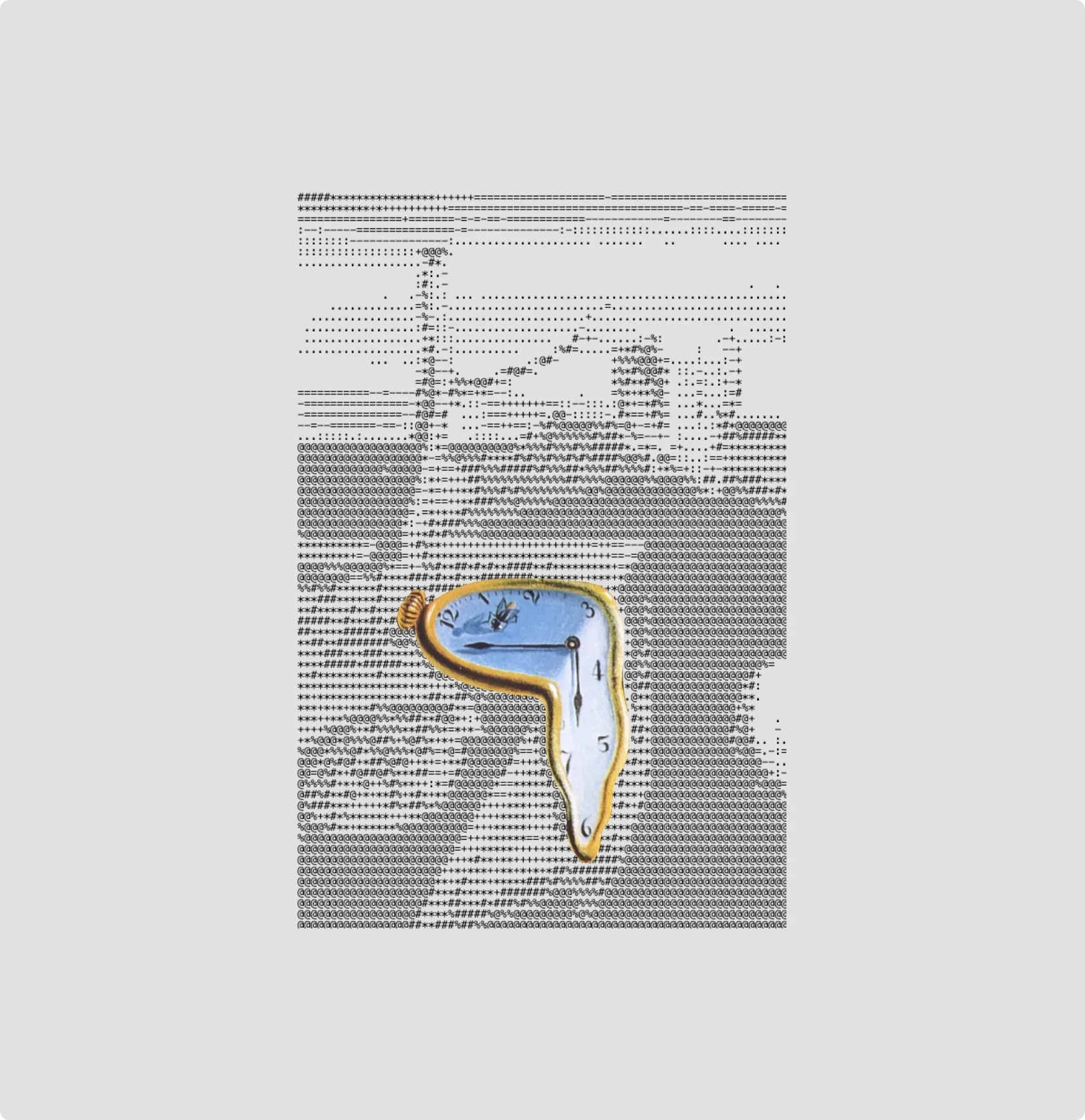
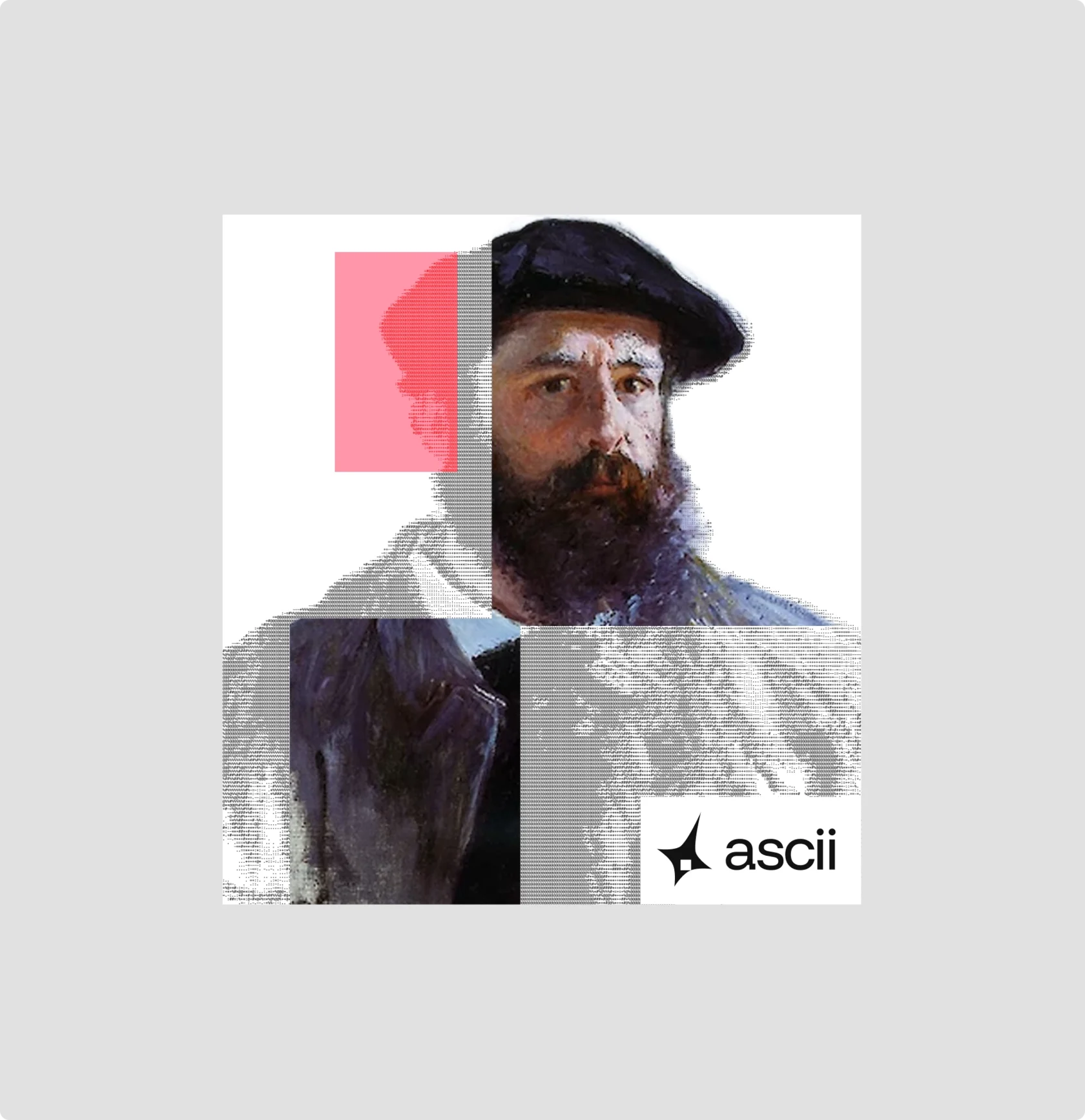
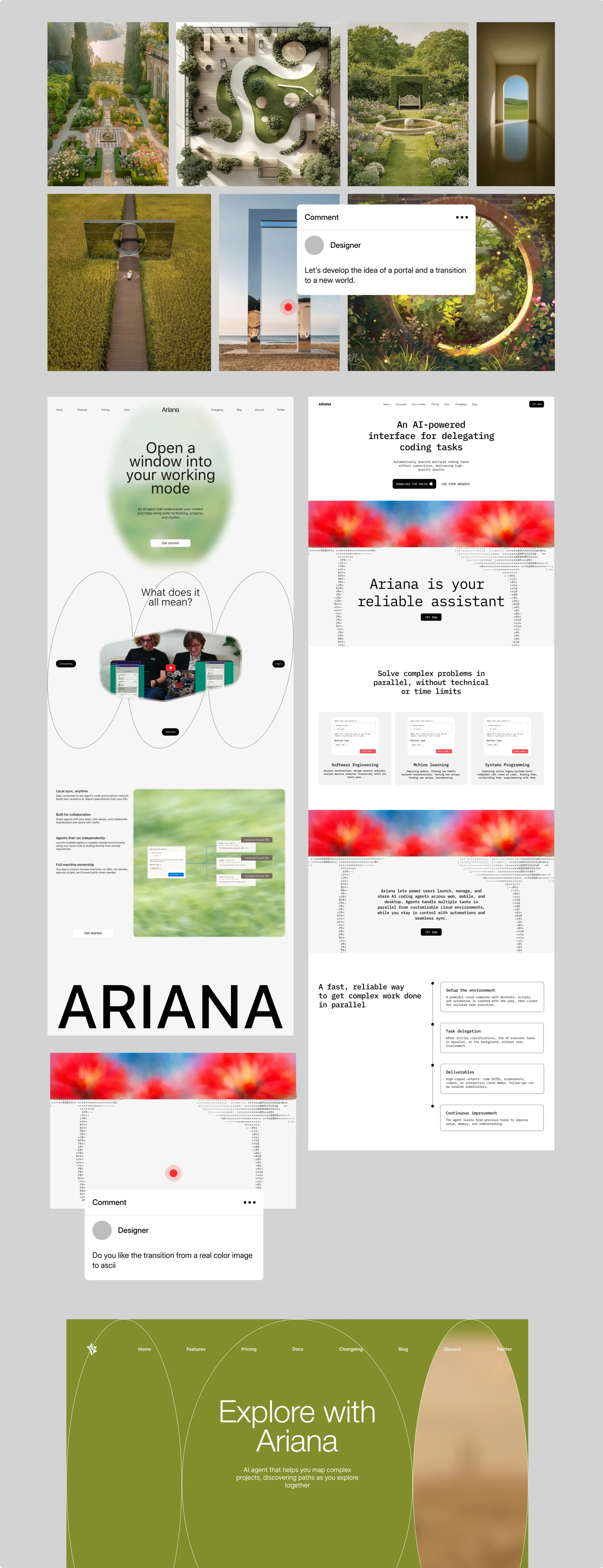
As part of developing the core idea, we explored several concepts for the digital portal. ASCII is your personal guide to the digital world, closely connected to the environment around you. The idea starts with the logo, where a partially closed “portal” creates a sense of an entry point into another dimension. This concept then evolves through the graphic language: we move into a new world where familiar cultural codes and art intertwine with the complex, structured world of IT and code.

Designer
→ Web-design
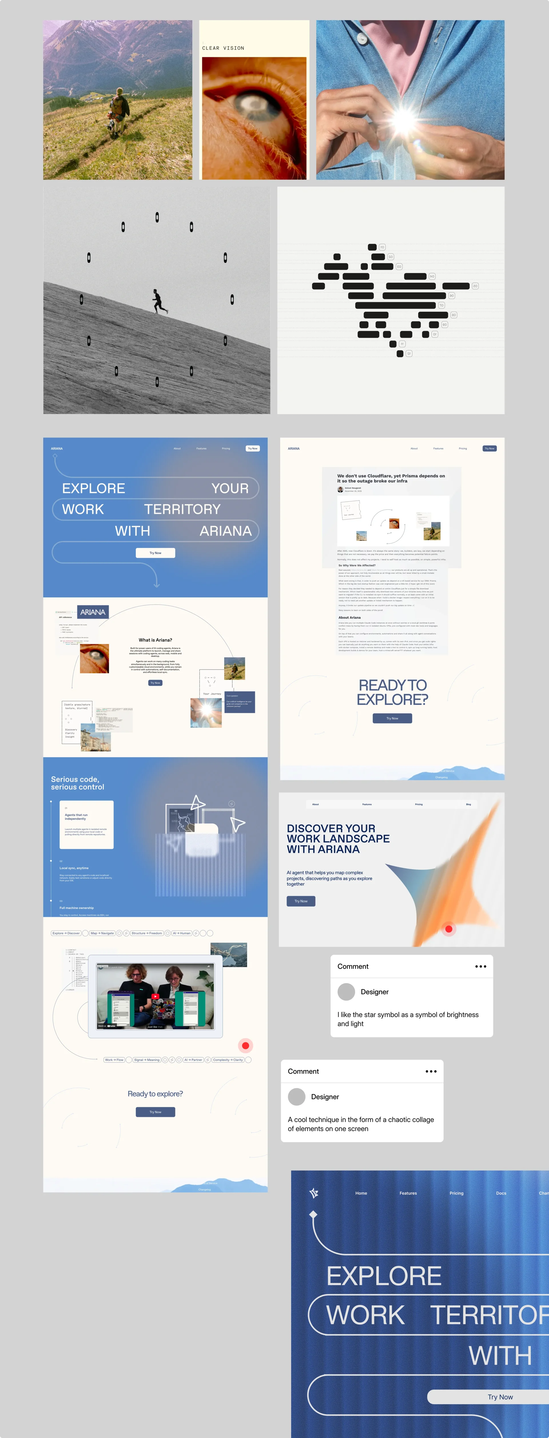
Chaotic collages woven into the design as a visual technique, not decoration, but narrative.
Website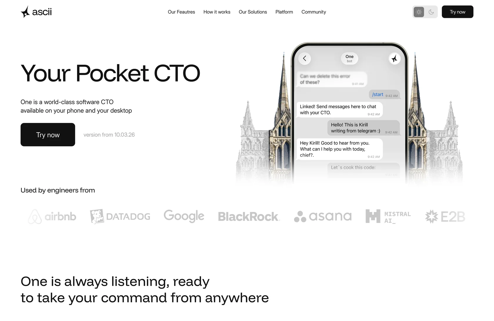
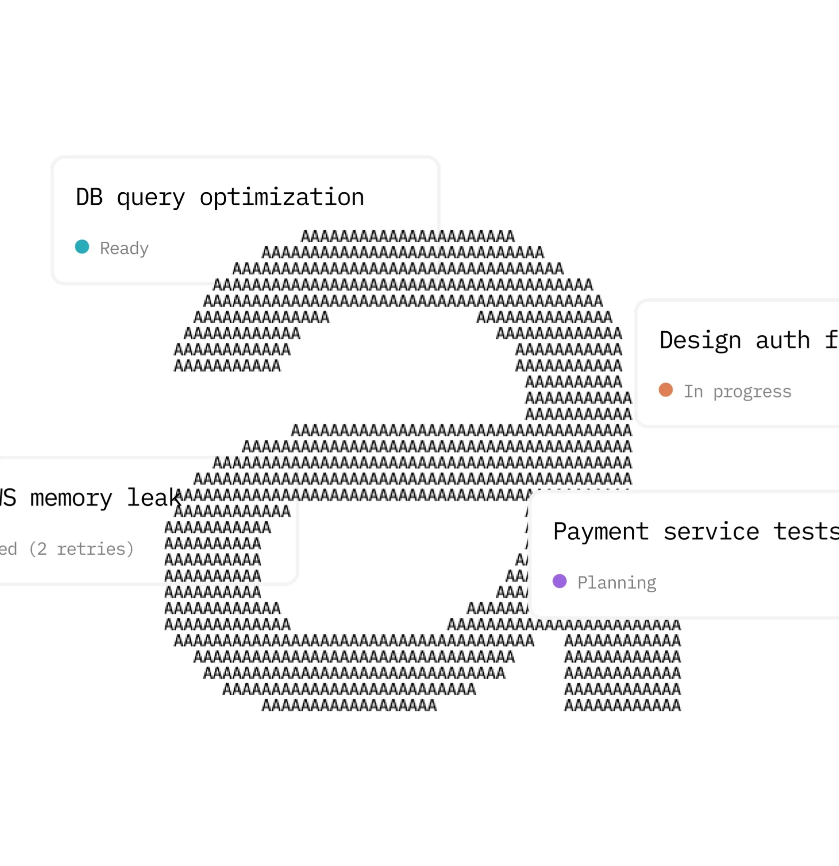
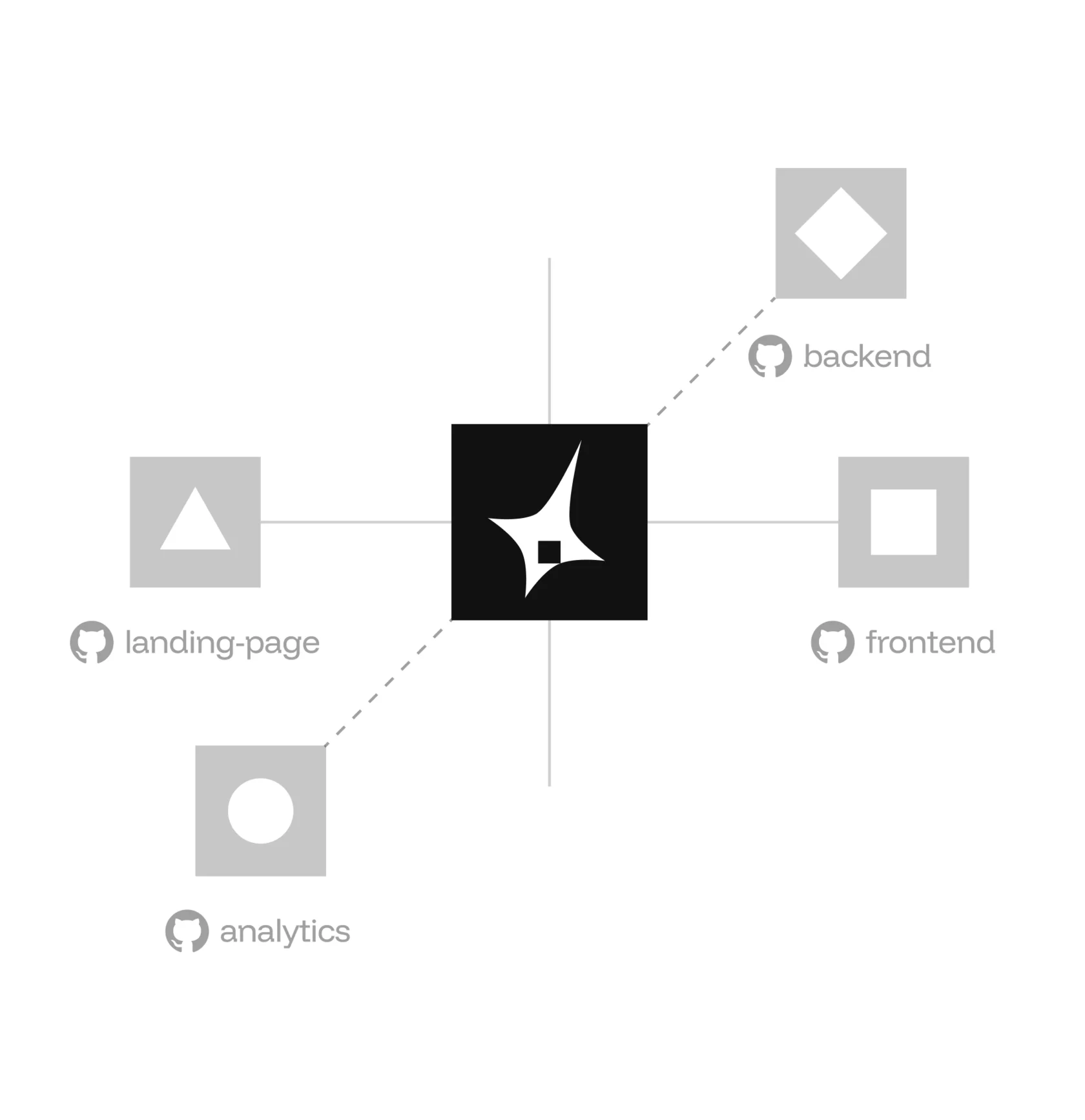
→ SMM media
Personal and corporate covers became the faces of the product in Linkedin & X, built around the personalities that inspire the client's team.
→ Assets
Thinking beyond single internet launch, designing for real-world constraints, and building structures that can grow without breaking.
R&D
→ Let's take a look at our work and the stages.
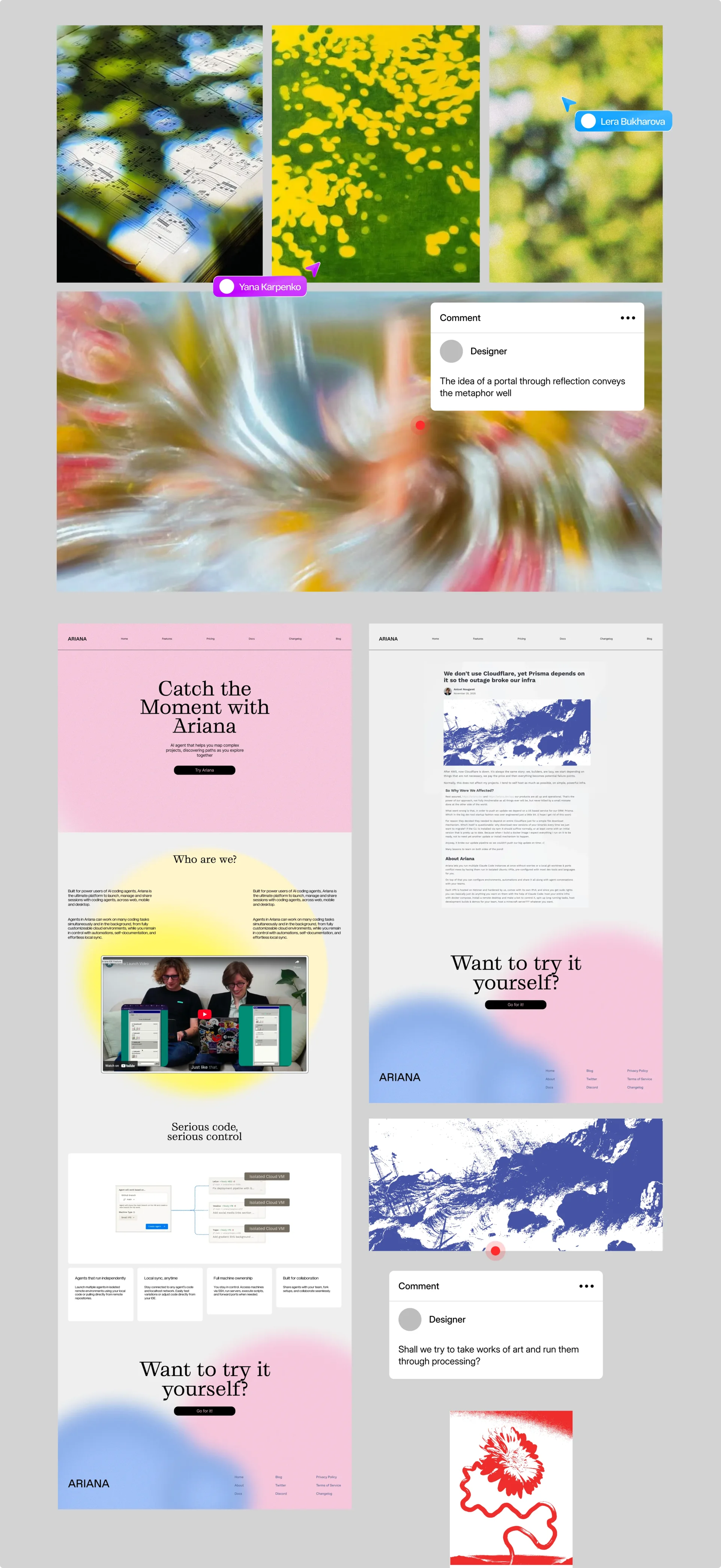
During the zero stage of preparation for the creation of concepts, we conducted a large survey of ideas and inspirations, creating first approaches and developing new concepts. The process was parallel in the discussion with the client and it helped to get feedback quickly, adjusting approaches and ideas.
Review
Kirill Makarov
Co-founder
As early stage founders, we value teams that take initiative, ship stuff and vibe with us, instead of asking questions. That's why Curves was a perfect fit. We loved the collaboration. Curves team execute fast and clean. They have real talent. They understood all of our weird nerdy techie requests, and we appreciate this a lot. Recommend 10x.
Team
Management
Anna Egorova
Christina Chervotkina
Yulia Myshlyaeva
Design
Egor Sokolov
Lera Bukharova
Yana Karpenko
Motion design
Nastya Dobro