
CultTech Summit
The annual international conference, dedicated to innovations at the intersection of culture and technology. The event brings together representatives of the creative industry, artists, investors and IT entrepreneurs to discuss the future of art and digital products.

Context
Bringing years of work into one system
CultTech had built up a strong body of visual work across several editions of the summit — different directions, different solutions, different moments. Our task was to pull together the best of it, identify what defined the brand, and shape everything into a single system the team could use, scale, and grow with. We worked through the materials side by side with the client, deciding together what to carry forward and where to set the rules.
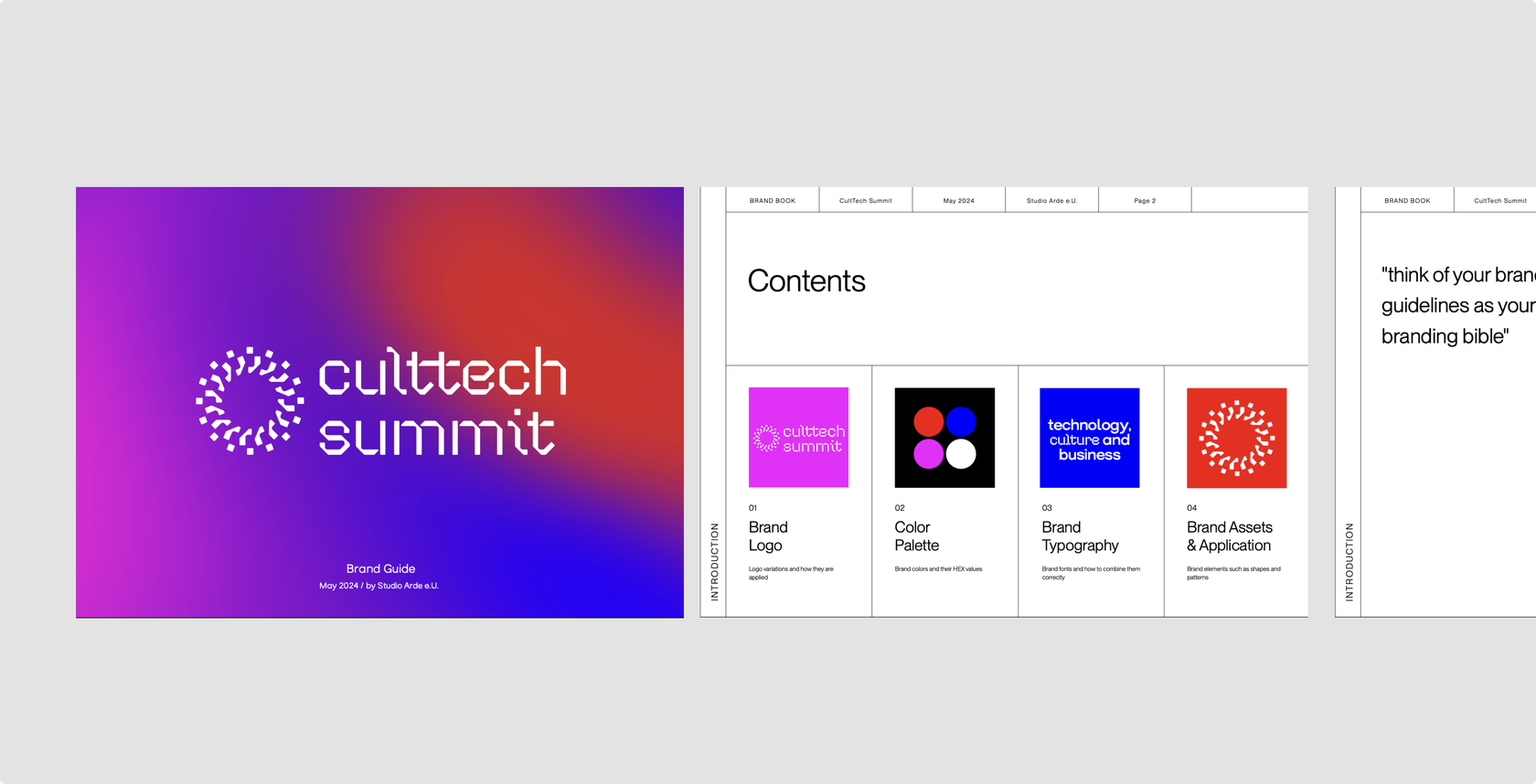
Concepts
We have developed narratives to build up the project concepts
We came up with a range of concepts to set a direction. The selected one would be worked on later.
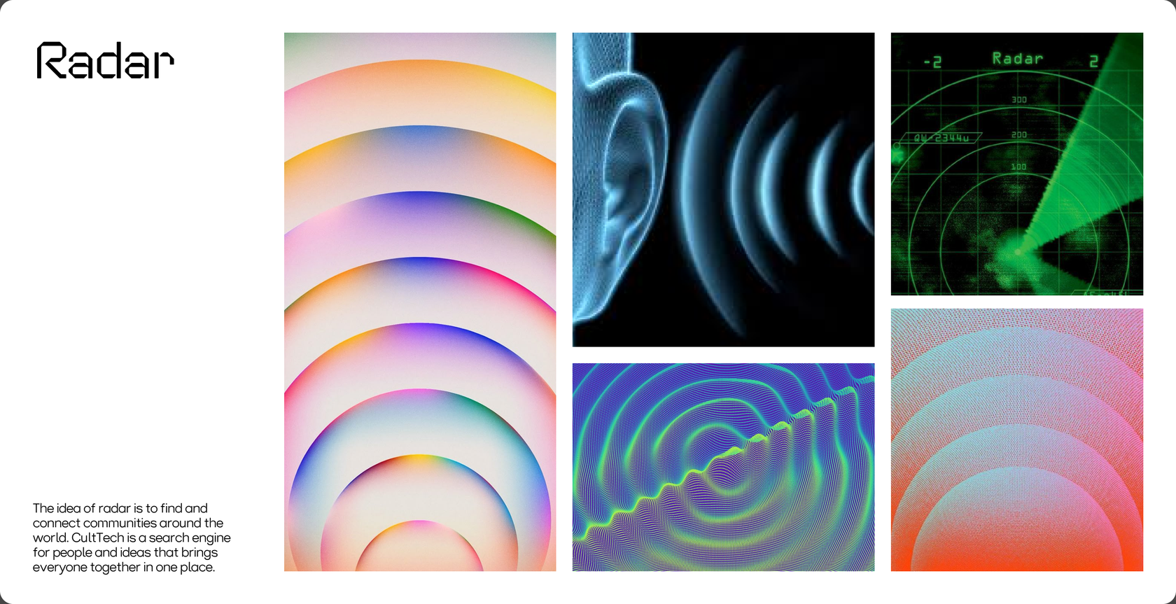
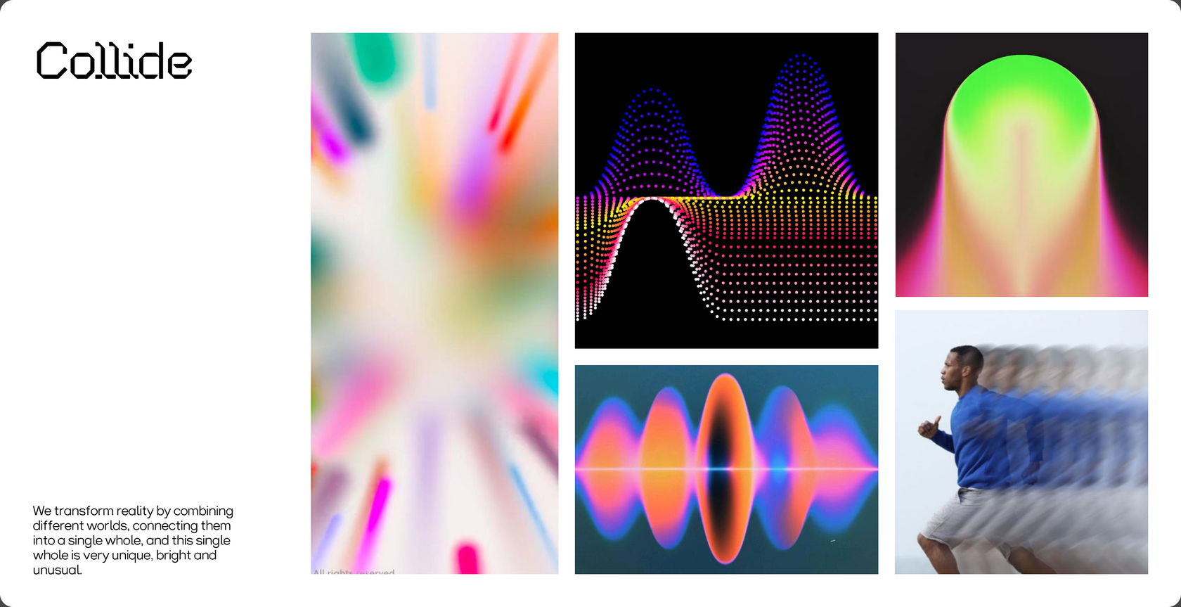
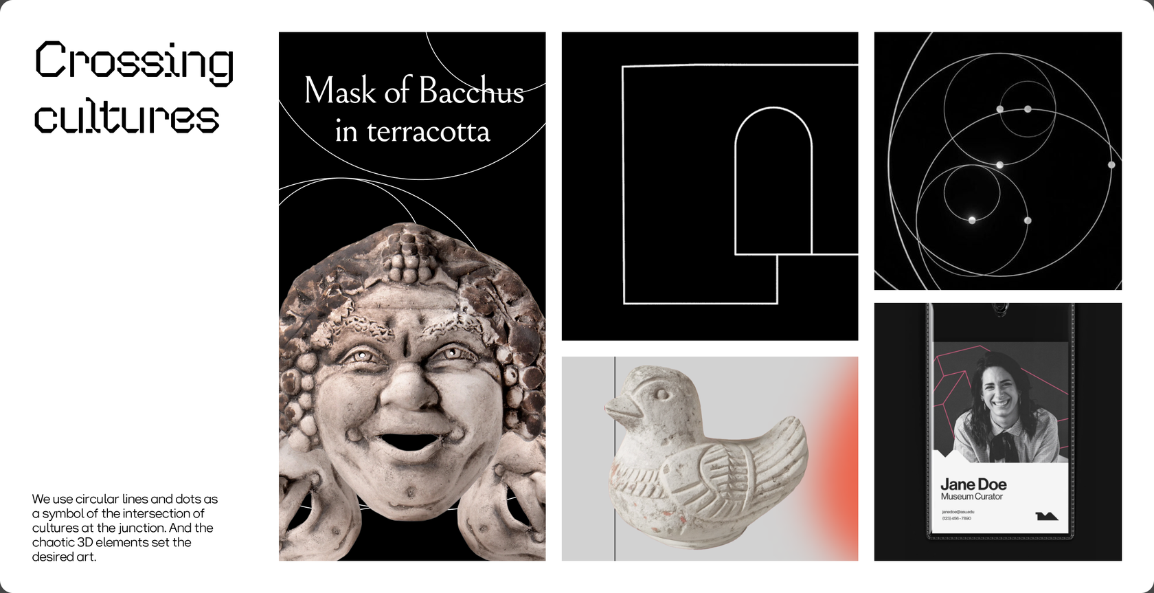
Our Key Visual
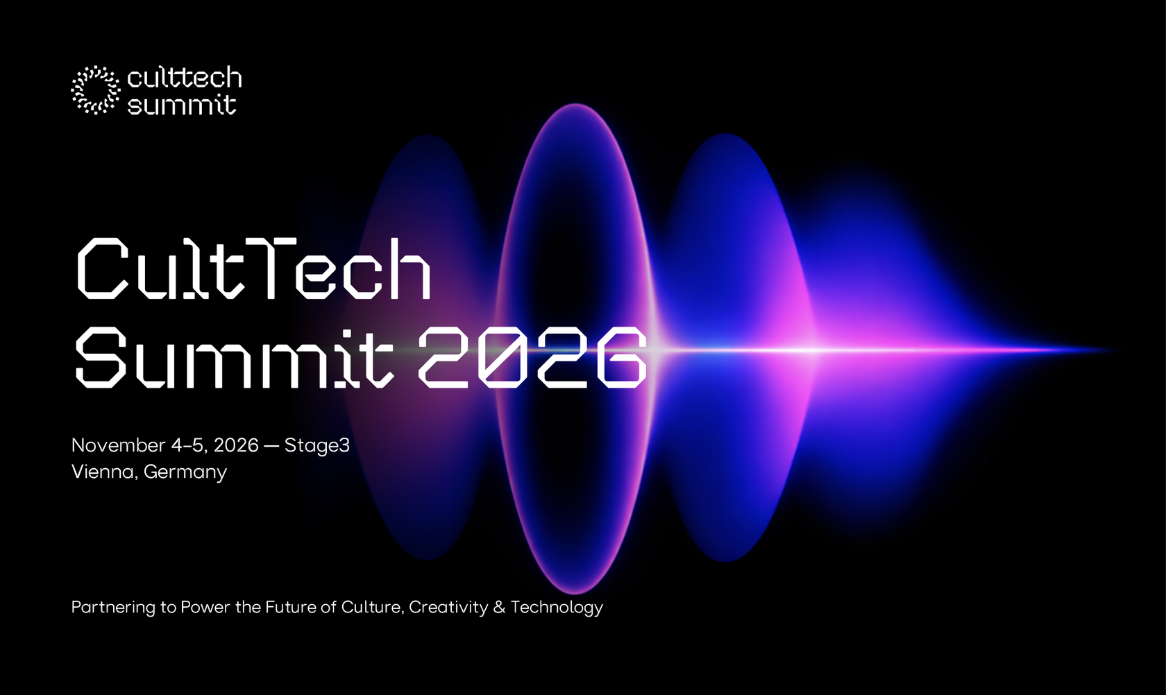
The idea of the collider as a metaphor for the unification of cultures and people
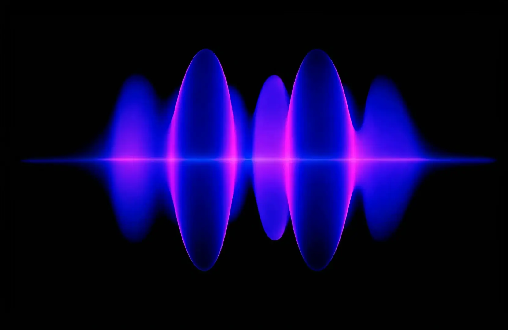
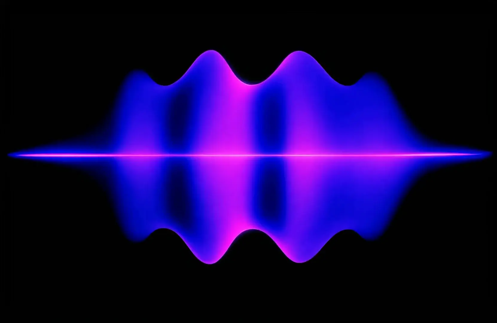
We have prepared a new key visual in the form of a collider. The idea of the visual is that the CultTech Summit brings together people from all over the world, their cultures and customs.
Updating
the design system
Keep what defines the brand. Rebuild everything around it
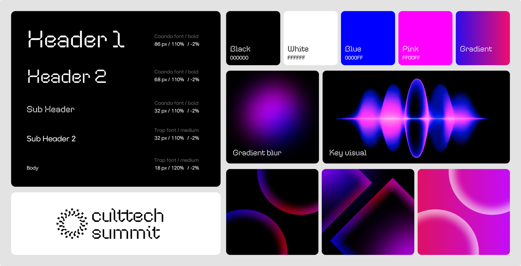
Typography, gradients, signature visuals, anything that made CultTech recognizable stayed exactly the same. Around that core, we restructured the existing materials, filled in the missing pieces, and designed the guidelines that pull everything into a single, applicable system.

Egor Sokolov
Designer
The style is based on the idea of the collider as a union of people and different cultures. Our community brings together various cultural milestones from all over the world. We unite into a single whole, representing such a geometric glow.
Web Design & Development
Where the new system meets the screen
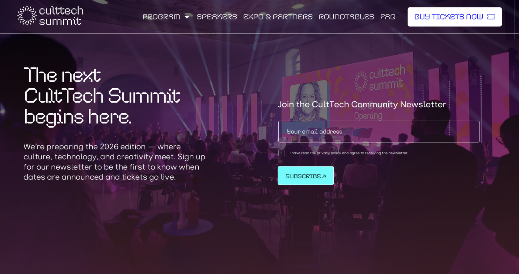
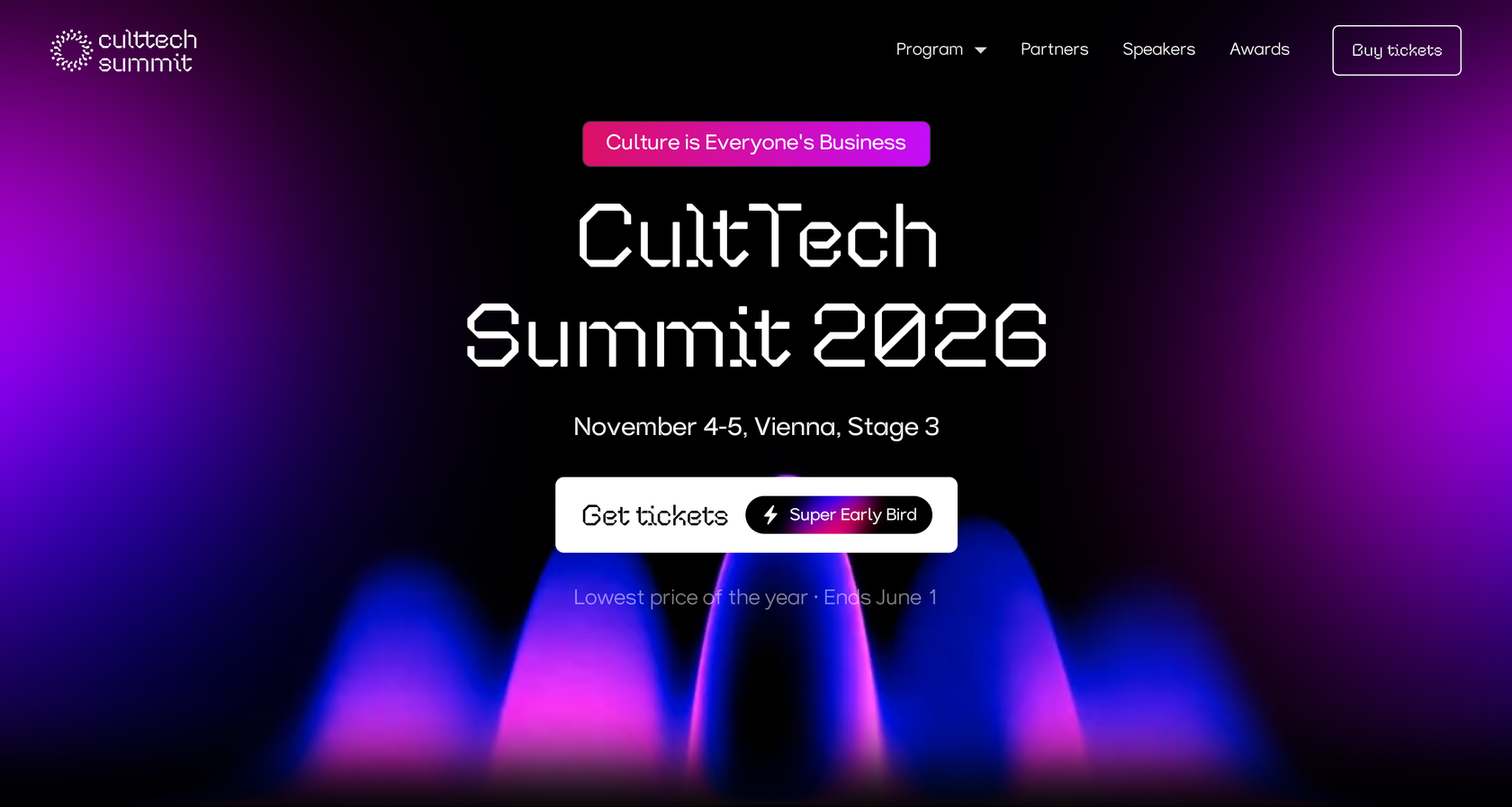
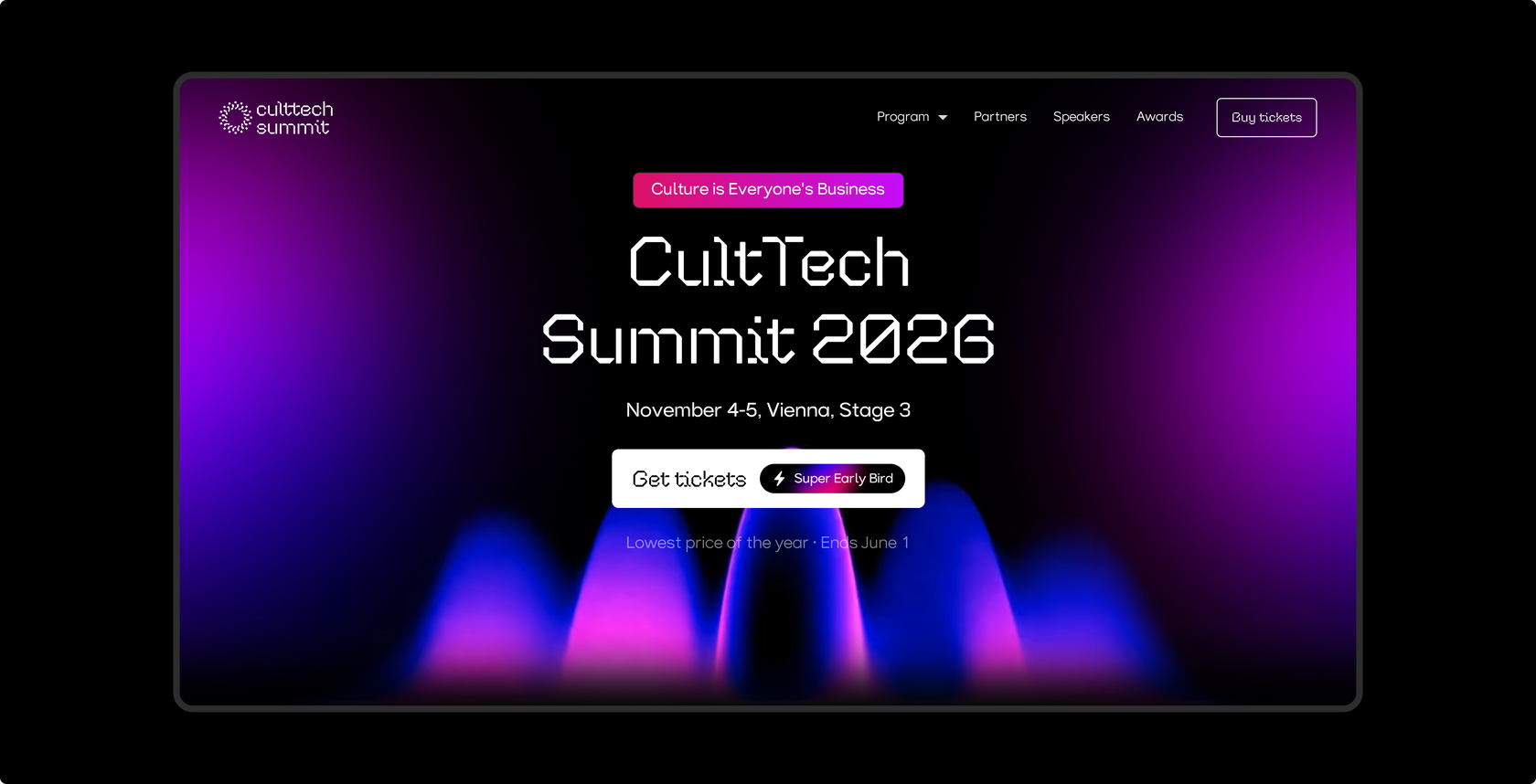
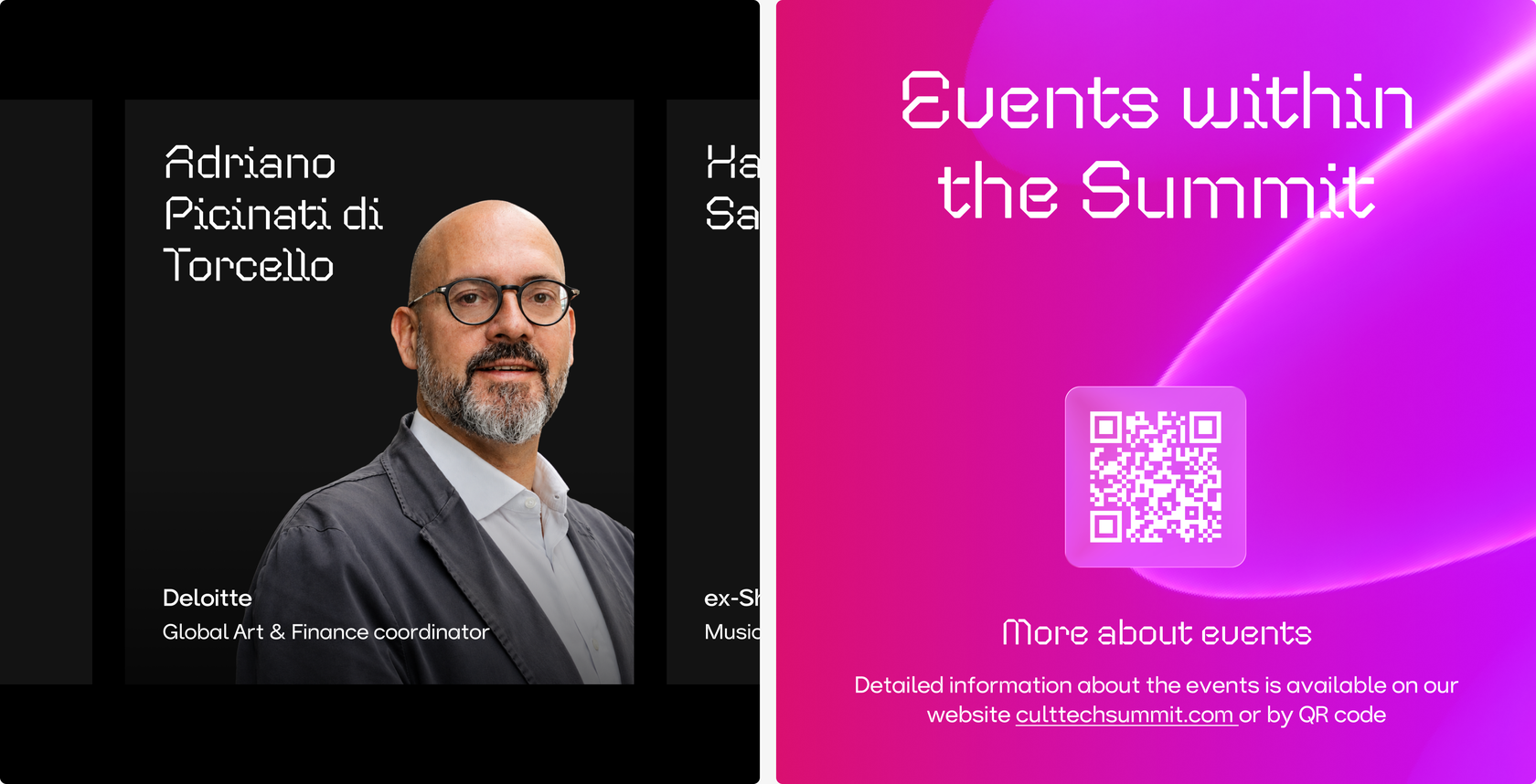
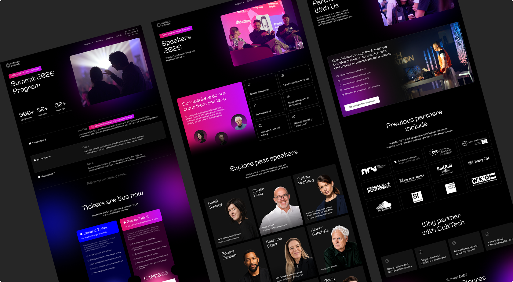
Rebuilt the visual part of the website considering new guidelines: new header, new footer, new buttons, new main page, and speakers, awards, and partners pages from scratch. And on the inside added a new admin panel that lets the team update any page any time, without touching a line of code.
Awards Special Page
A side project
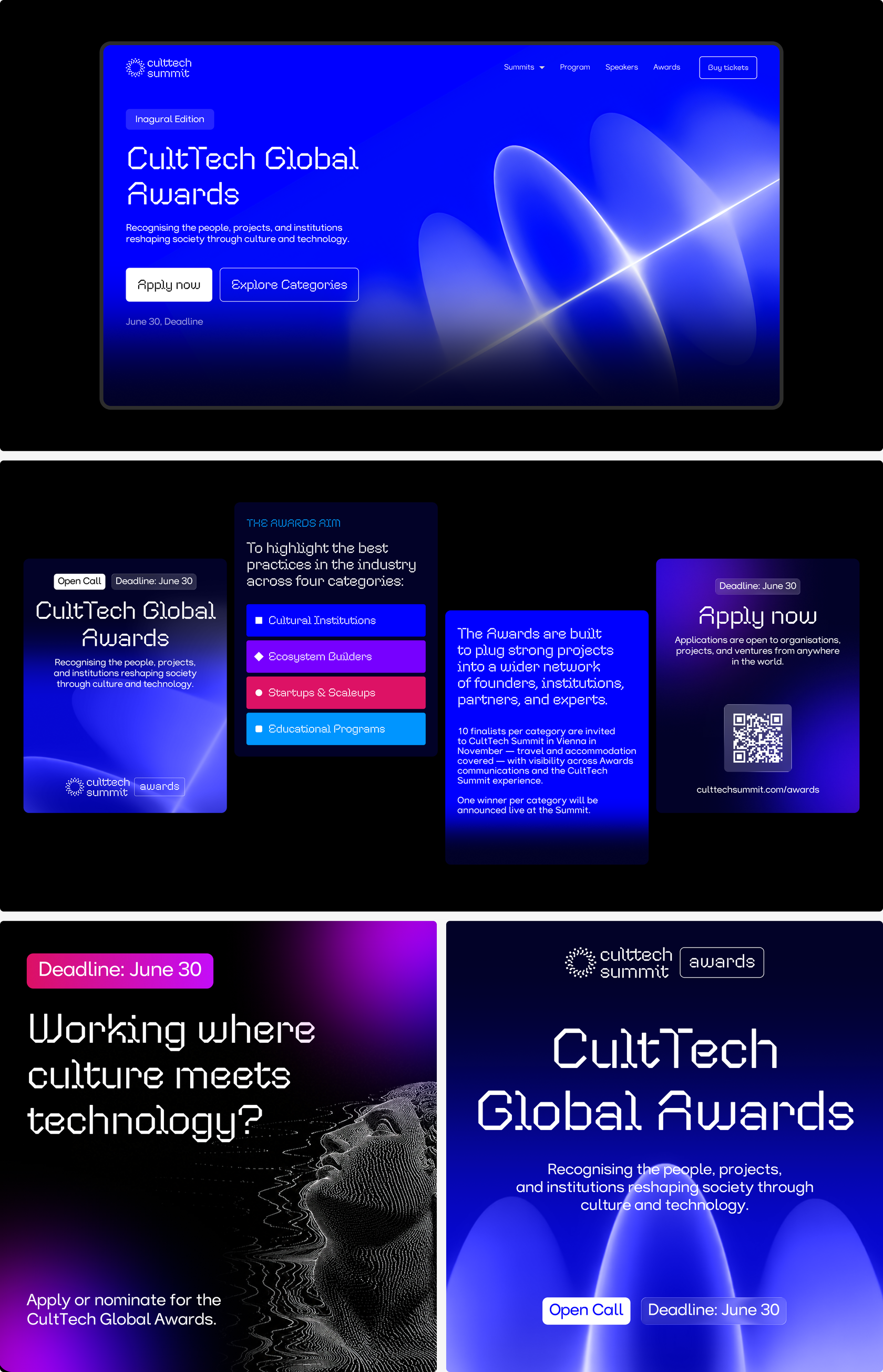
This year, the Awards became a separate moment within the summit and called for design that matched. We treated the page as its own mini-project: a distinct visual direction, a dedicated color pulled from the main palette, and new layout and development solutions built specifically for it. Different on the surface, but still running on the same system underneath.
Communication Materials
A ready content system for a team to run with
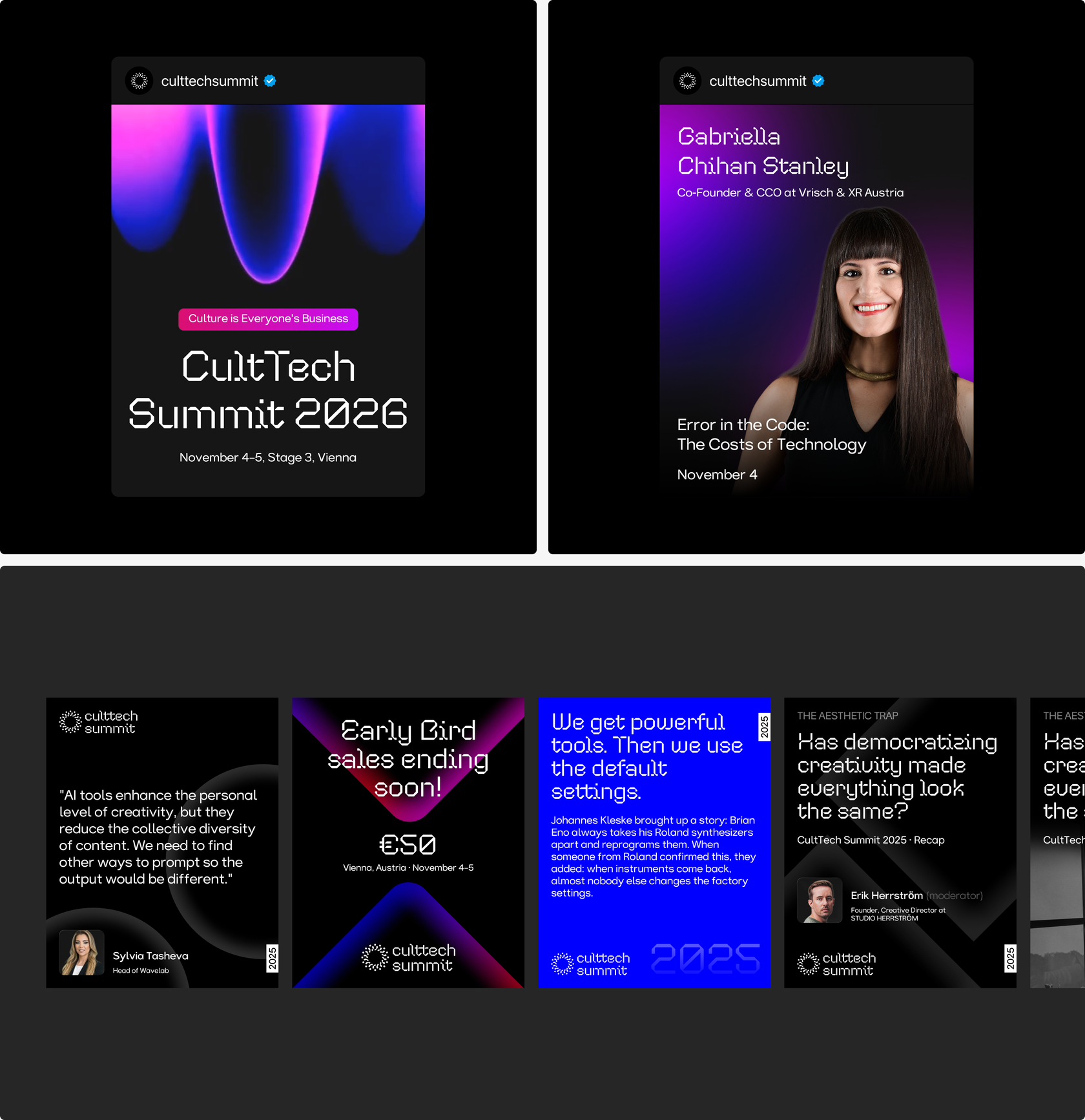
Building on the new Key Visual, we developed a full set of assets across CultTech’s channels, Instagram posts, Facebook covers, LinkedIn graphics, ad creatives, business cards. Every format is built to be reused and adapted easily, so the team can keep producing on-brand content without starting from scratch.
Claude Design Skills
Design assets, generated on demand in minutes, not days
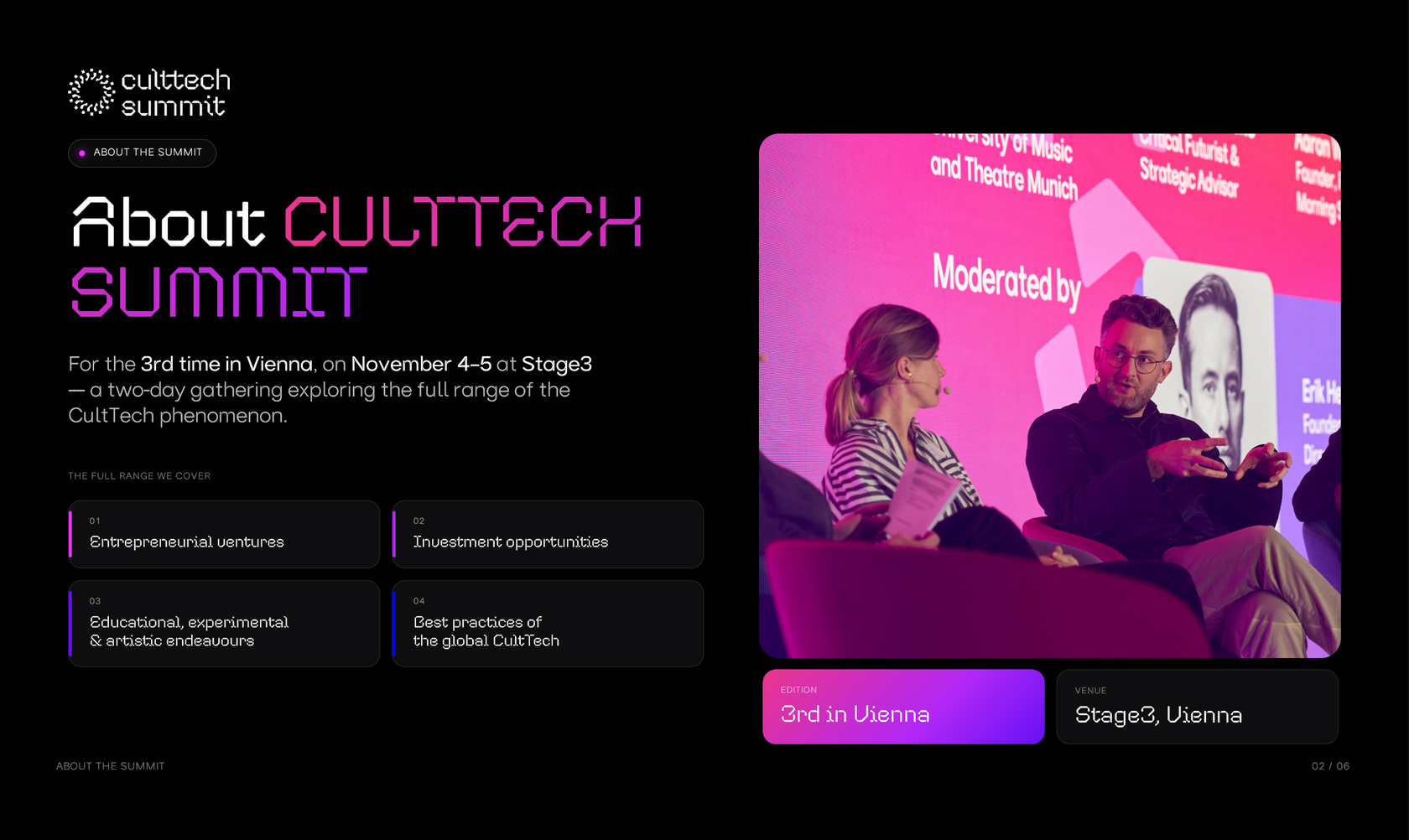
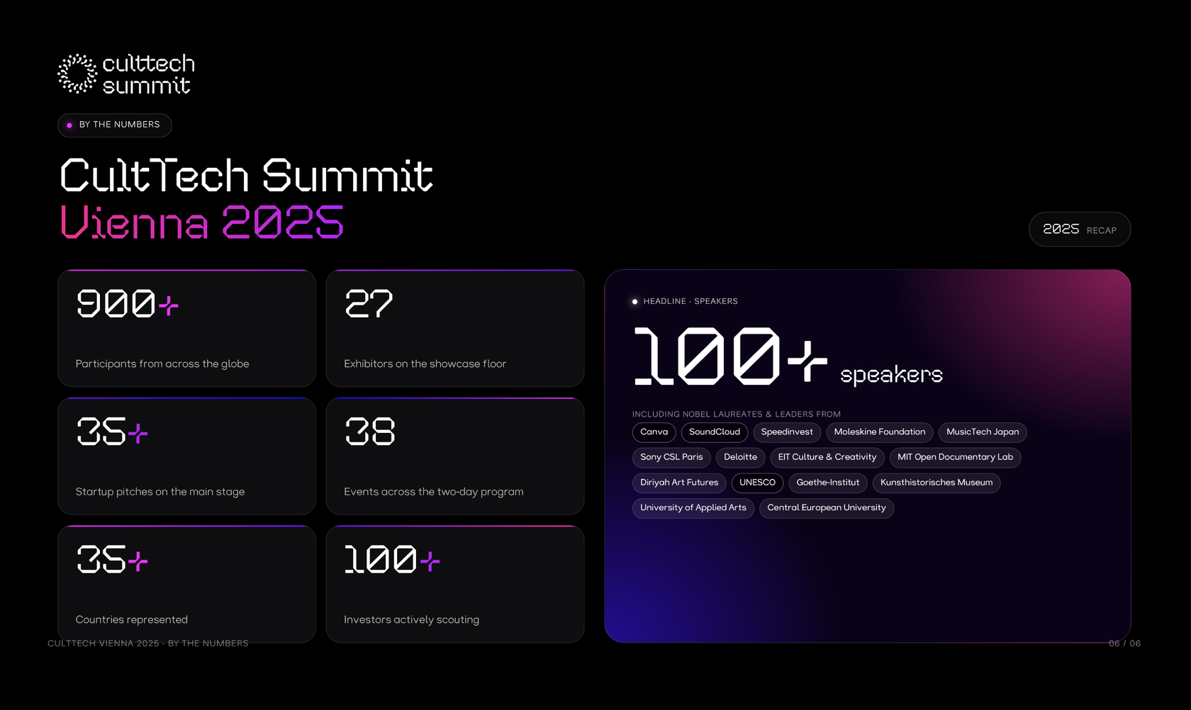
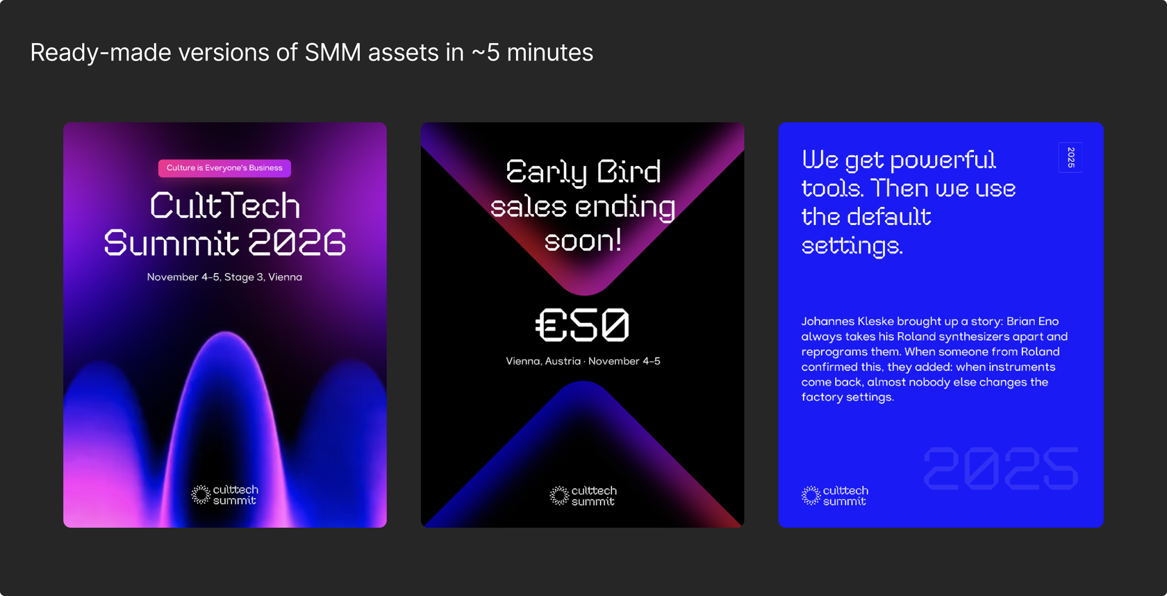
We uploaded CultTech’s full design system to Claude Design, tuned the prompts, and built an automatic content generation pipeline on top. What used to take hours to put together now takes 5 to 10 minutes. And the team can adjust the output with prompts, no design tools required.
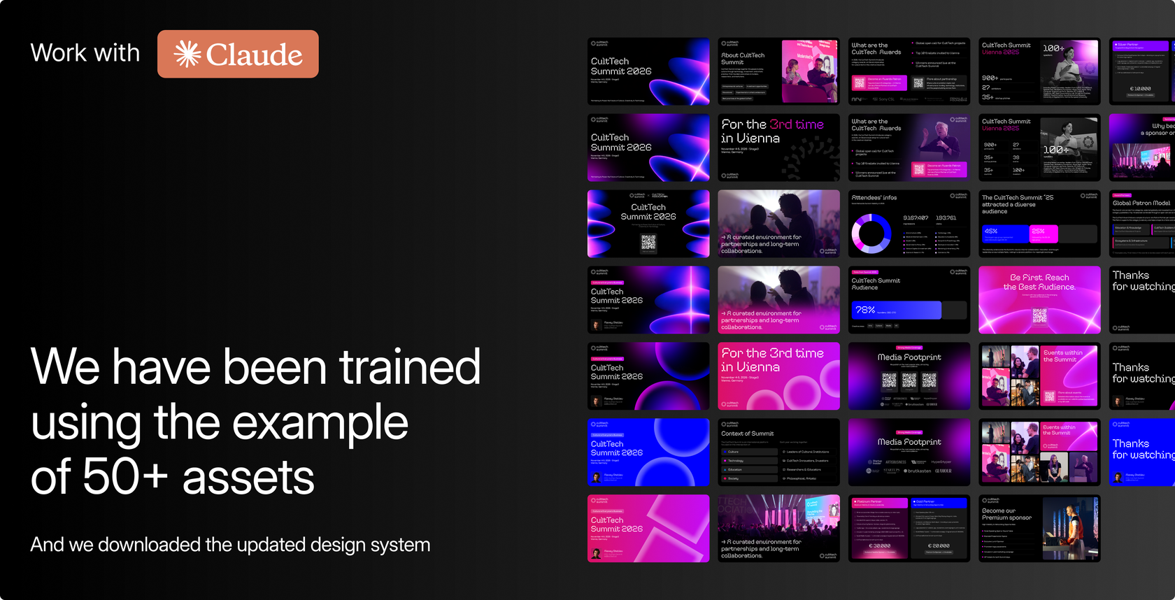
Ready-made versions of presentation screens in ~5 minutes
Review
Pavel Yablonskiy
Head of Marketing & Communications
Before working with Curves, we used to have several separate contractors, some doing web development, some in charge of design, which was oftentimes a mess because it’s a little hard to coordinate individual freelancers and contractors. With Curves, the best thing was having all of it under one roof, with brilliant project managers from their side taking care of all the communication between different parts of the team and keeping us all on the same page. They were also really flexible in terms of the workload and the speed of it. We had some unexpected issues on our side, and the guys at Curves dealt with them brilliantly, showing a lot of understanding.
In terms of efficiency and, even more importantly, aesthetic values, Curves were one of the best agencies we’ve ever worked with. It felt like everything was under control. And oftentimes Curves would actually suggest some extra improvements or developments that we hadn’t thought of ourselves, which showed that they really care about the project they’re working on for us, rather than just blindly doing what they’ve been asked to do.
Team
Management
Yulia Myshlyaeva
Danya Shamilin
Design
Egor Sokolov
Development
Pavel Potemkin
QA
Anna Rozhkova