
Our objective
Rebranding with continuity and brand extension not only for conference, but also so that the initiative can grow in different directions — from events to digital platform.
Nomad Summit is a long-standing event in the digital nomad world. First launched in 2015, it has a rich history — and in 2025, a new chapter begins.
Nomad Summit is a long-standing event in the digital nomad world. First launched in 2015, it has a rich history — and in 2025, a new chapter begins.


Nomad Summit — an open platform where a community of digital nomads, techies, indie hackers, and creators come together to build meaningful ventures, skills, and connections. Nomad Summit isn’t just a conference; it’s a collaborative space where ideas meet action.
What is Nomad Summit?
The concept
Our metaphor
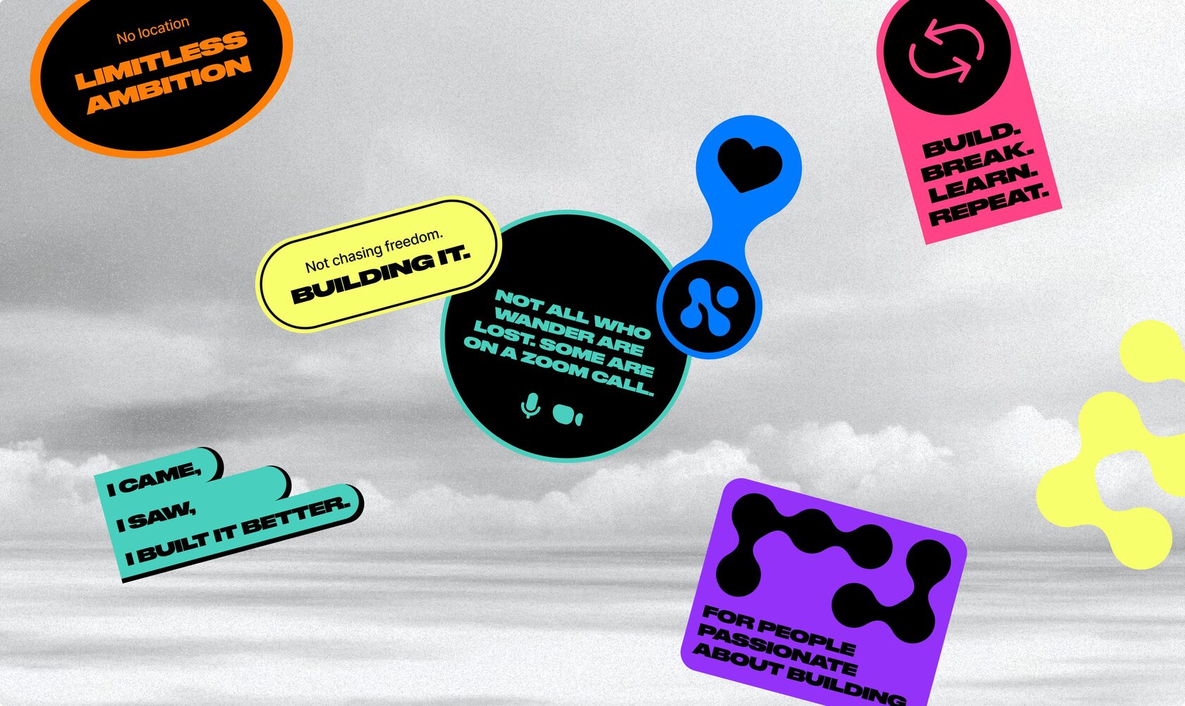
We formulated the Connecting to Build slogan, which formed the basis of the visual concept. The metaphor of connected dots symbolizes connecting people, ideas, businesses to build and develop together.
Visual Identity: our mission in design
Nomad Summit’s rebranding goes beyond aesthetics — it visually represents its mission. The connected dots symbolize independent nomads forming a global network, while the colors and typography reflect movement, growth, and innovation.
The connected dots represent the ideas of unification, collaboration, and creation. Dots = people scattered across the world, yet bound by a shared mindset. Lines between dots = the relationships, interactions, and opportunities formed at Nomad Summit.
Branding
Logo
We created the main logo, as well as designed a symbol that we believe can become memorable in the future as the brand grows. The symbol of connected dots symbolizes the main idea of the renewed brand.

Visual language
At the heart of the visual language are dots and their connections. We pulled the visual metaphor through all the branding materials, but tried to keep each one unique.
Connections function as separate graphics or act as shapes, flowing from one medium to another to form cohesive compositions.
Assets
We have built an impressive set of assets for both digital media and offline venues. Our goal was to have every element at the heart of it and to make sure that attendees would want to wear our t-shirts even after the conference.
A01
A06
A05
A04
A02
A07
A03
A08
A09
A10
A11
A12
Demo version of Card ID from 2025
idea of Puzzle Card ID for 2026
Nomad Passport 2026
Since 2026, Nomad Summit has been issuing a passport for Nomads. After registration, each participant will receive their passport, which must be filled in with achievements for their activities at the event.
Nomad Summit IRL
During Nomad Summit, incredible things happened. And everyone loved our posters so much that we gave them extra life and fun even after the conference. Just look at all the places our posters have been.

Feedback
Kai Island
New co-owner / Program
Working on the rebrand of Nomad Summit together with Anna and her team was truly a valuable experience. Not only did we get a great end result but it was a truly insightful and collaborative experience. We started with defining the values for the brand and then went more practical with each step. I cannot say we were an "easy client" :) (with still some uncertainty when launching a new brand, different opinions in the team, busy schedules etc) but Anna and her team were really there to support us and guide us through the whole process. I would recommend to work with them in a heartbeat — because it is not only about the beautiful end result but also the thoughtful and professional guidance you will receive throughout the journey.
Team
Valeria Pitiyakova
NGM Team
Special Thanks
Egor Sokolov
Design
Anna Egorova
Management
Yana Dulina
Art Direction